As a professional logo designer, I understand that a professionally designed logo provides more value than a templated online tool, including but not limited to providing a more brand-ownable experience. But hiring a professional might not be an option when you are just starting.
There are principle elements to remember during the logo creation process that are imperative traits for an effective logo design that celebrates your business’s brand correctly and appeals to your perfect audience.
Whether you DIY a simple logo concept or hire a professional designer, these FIVE elements are important considerations for your brand’s foundation.
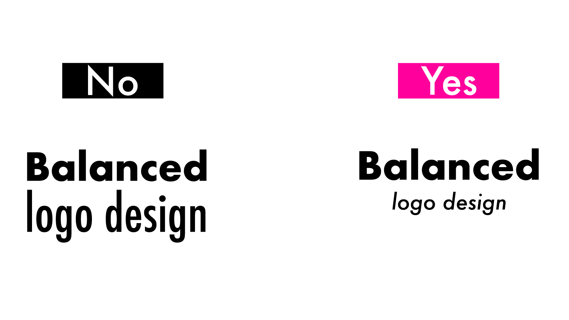
Like anything in life should be in moderation and balanced, so should your logo design. The weight and size emphasis should be on your company’s core name. At the same time, supportive text like “solutions,” “incorporated,” “professionals,” etc., can be secondary to the primary name and smaller underneath.
For example, look at these design samples for “Balance Logo Design.” Balance is the core name, while “logo design” is supported and balanced underneath.

Applying balance to not just the typography but also the brand icon and coloring is an integral approach to a great design.
If someone knew nothing about what you did, can they gather some information about your business from your logo? For example, can they identify if you are a luxury brand or mainstream? If you cater to a modern or more traditional customer? Your logo is speaking on its own through colors, typography choices, and shapes. It’s essential to see what “appeal” your logo may have and identify to who your logo is appealing.
So often, not working with a professional designer will lead to not having the correct files for your logo that you need. Companies will often use a rasterized JPEG file of their logo for years, not knowing they need to have their logo built in a correct outlined vector format. A vector format will enable their brand to easily transition across swag, clothing, large format print, and digital marketing mediums.
At a minimum, here are the recommended logo files you will need for the ultimate marketing flexibility:
Similar to “Appealing” to the right audience, your logo should also communicate your brand’s personality and mission through its use of colors, typographical choices, and style. This is difficult to achieve if you aren’t using a professional designer; however, it’s essential to ensure your logo matches the TONE of your business and its products or services.
Big companies rebrand every few years to keep up with the times; just like fashion trends update, so do trends in marketing and graphic design. Keeping your business looking relevant and competitive in a crowded digital landscape is critical.
Research brand, design, and marketing trends emerging at the time of your brand launch and see which trends make sense to incorporate into your brand presence.